JL
Lighting and emotions in physical and virtual spaces: A virtual experience to provide a universal alternative for people with limited access and physical constraints to art exhibitions.
Immersive light exhibitions blend space, light, and emotion, but access is limited by location, cost, and mobility. As virtual technologies grows, we lack evidence for how light feels across mediums or how to translate physical installations without losing intent.
🎟️ Limited access
Geography, ticket prices, and mobility barriers
🧭 No translation playbook
Few guidelines for moving physical light works into VR
🎚️ Emotion shifts by medium
Physical rules don’t map 1 on 1 to virtual scale or presence.
💸 High production risk
Building full-scale exhibits is costly to prototype
📊 Evaluation gap
Fewer studies linking light settings to emotional outcomes in virtual Environments
LightCube explores whether virtual technologies can offer universally accessible ways to experience light-centric exhibitions, without flattening the emotion. I built a controlled human-subject study comparing white, red, and blue lighting across a physical room and two virtual rooms (one scaled), complemented by interviews and field evaluations.
Access shouldn’t take away the awe moments. If light is the medium, can VR carry the feeling?
🎯
Map emotions under in physical vs. virtual rooms
🎯
Test how room scale modulates comfort or anxiety
🎯
Translation properties to preserve artistic integrity
🎯
Design guidance for accessible virtual exhibitions
Lighting and space have long been subjects of interest across disciplines such as architecture, art, psychology, and technology. Immersive light-based art exhibitions captivate audiences with a blend of space, light, and emotional impact.
However, research shows that some people have limited access to these spaces because of location, cost and mobility constraints.
This research explores the potential of VR to provide universally accessible alternatives.
A key component of this research was an experiment comparing spatial perception, emotional responses, light color representation, and comfort between physical and virtual environments.

What?
A comparative experiment assessing emotional responses including relaxed, energetic, anxious, excited, sad, happy, comfortable, and bored feelings as well as perceptions of spaces.
Where?
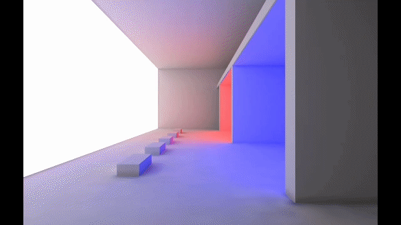
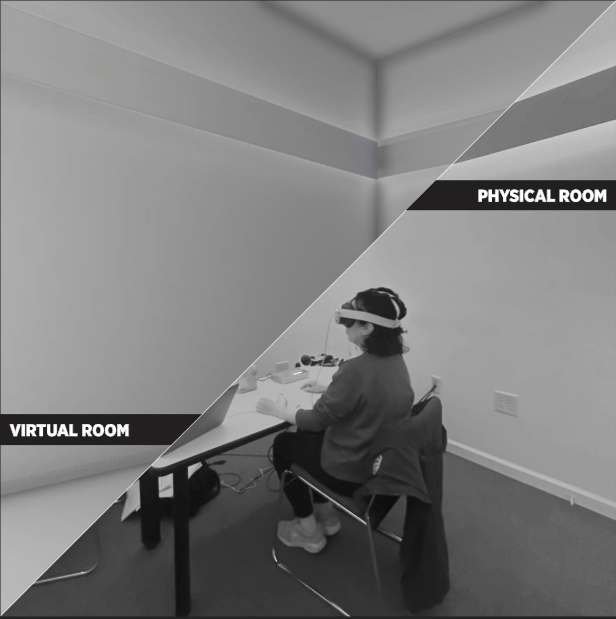
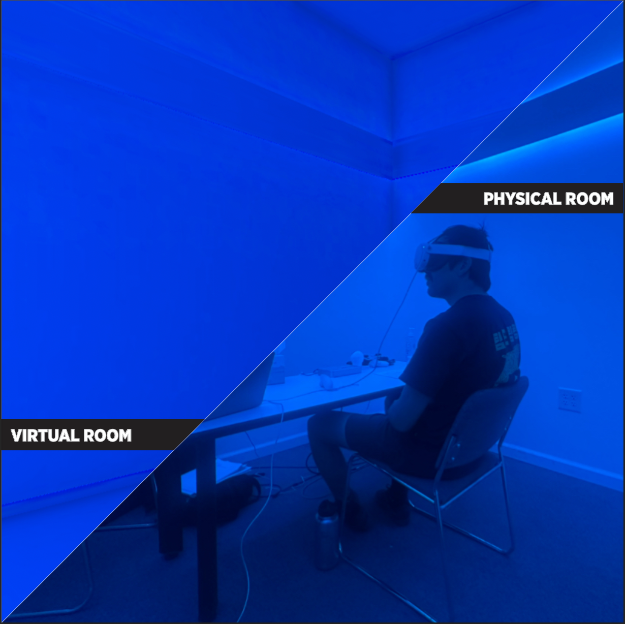
The study was conducted in a controlled light room located at the California Lighting Technology Center, equipped with an RGBA color-changing lighting system and DMX control.
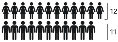
Who?
23 participants between 20 to 43 years old.
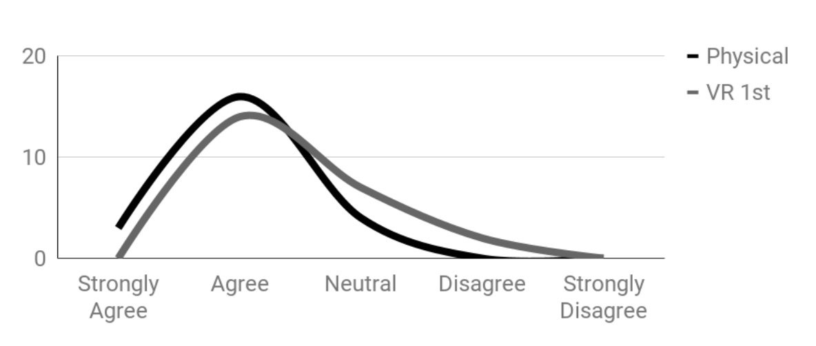
White light is associated with positive and comforting feelings.
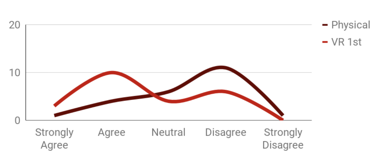
Red light is associated with feelings of anxiety and excitement.
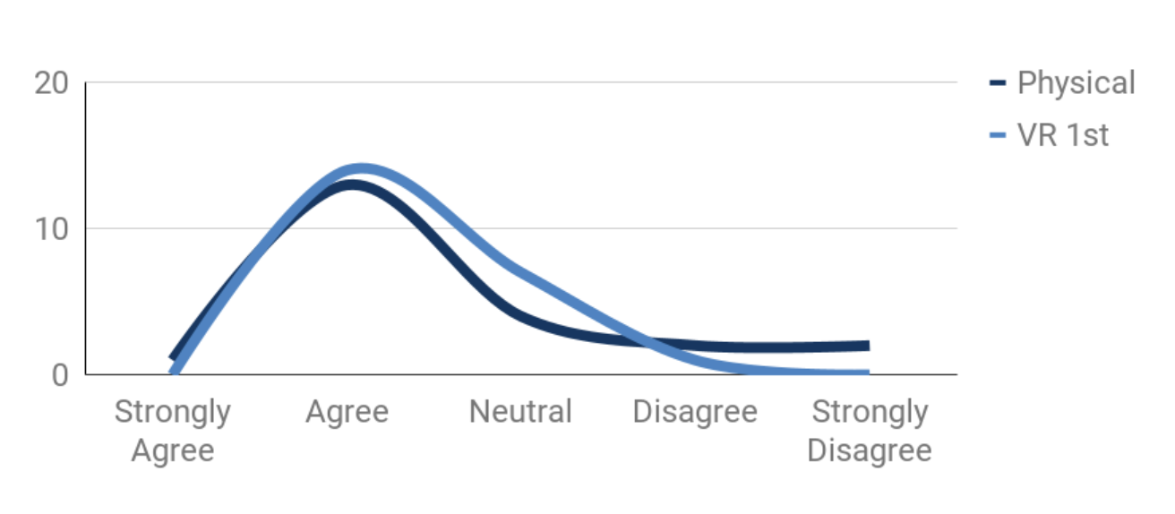
Blue light is best for promoting relaxing and comforting feelings.
White Light
In virtual environments, to make white light more comfortable, the space should be more open to reduce feelings of anxiety.
Red Light
In virtual red light, the scale of the space does not affect perception as much, but it still tends to invoke heightened arousal rather than calm.
Blue Light
In the virtual blue light, to enhance comforting sensations, participants reported feeling more relaxed in smaller spaces.
Ladan Johari | University of California, Davis

The Study Setting
I followed a Design Thinking approach to guide this project, from empathy to testing, because it allowed me to stay user-centered while solving a complex, abstract problem.
Where?
A controlled light lab featuring a physical room, a simulated virtual room, and a second virtual room manipulated in scale with white, red, and blue lighting colors.
Who?
Twenty-three participants aged 20 to 43 years.
What?
Similarities and differences in sensory perception, proving that virtual spaces can evoke emotions akin to those observed in physical settings.

Let’s Create with Intention
From concept to craft, I bring ideas to life. Reach out and let’s begin.
Get in Touch